Breaking Free Living Well Counseling
Breaking Free Living Well is a faith-based counseling and life coaching center established by Pastor Gaspar & Michele Anastasi in September 2020 to provide emotional and spiritual support to their community. When asked to design their branding, I chose a palette of blue, red, gold and green. Both the colors and fonts were chosen to feel classic yet modern, soothing yet bold, warm and yet cool. The logo utilizes the freedom inherent in bird imagery paired with a sans-serif font that feels strong because of its thick strokes and friendly because of its rounded angles. See more on the BFLW website, which I also designed.
Tri-fold Brochure

Side 1

Side 2
Social Media

Grief to peace
All the headlines in this campaign use a before-and-after dichotomy to emphasize the difference BFLW can make in the lives of its clients.

lost to found
The loneliness of emotions like lostness combined with the very individual nature of counseling led me to use stark white backgrounds in the campaign.

old to new
Crisis marriage counseling and coaching presents an opportunity to add warmth to the campaign while maintaining the coolness of the design.

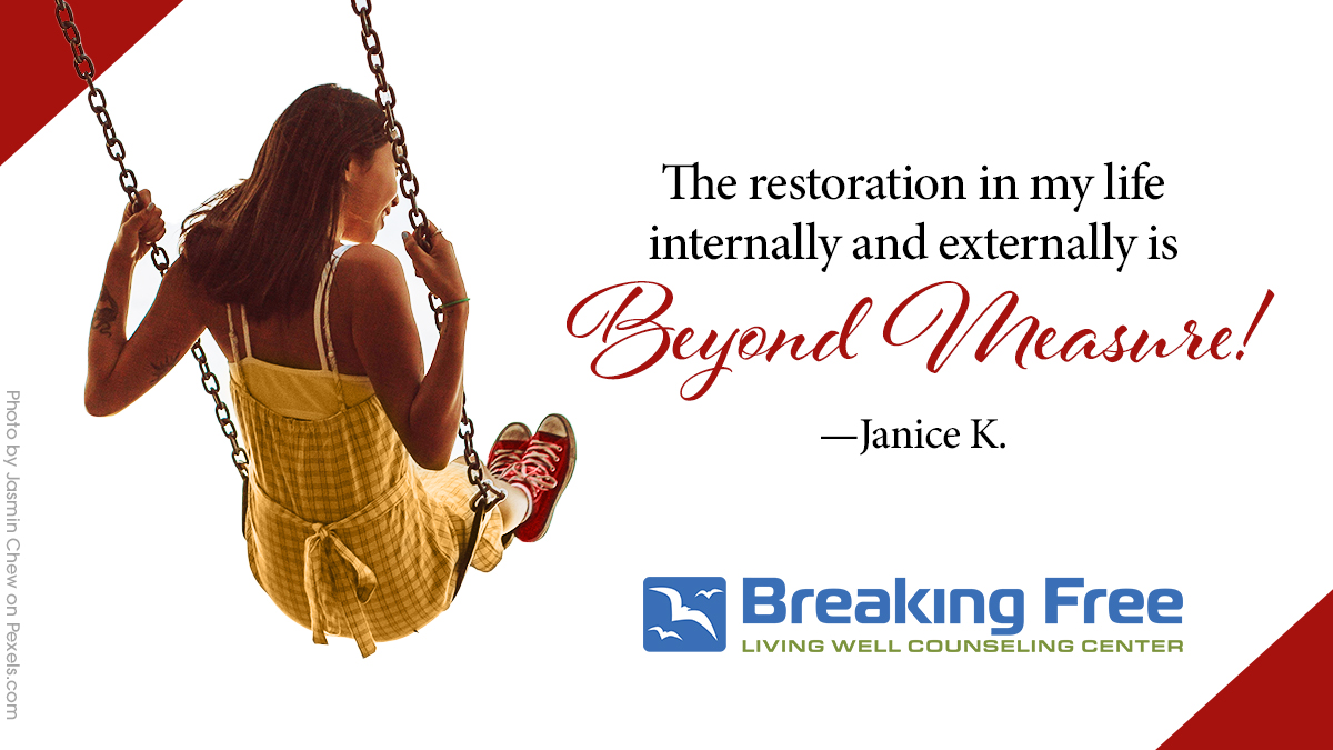
Testimonial 1
Client reviews are a great way to build a new brand. This is a secondary campaign used in social media to increase awareness and confidence in BFLW.
Testimonial 2
The colorful corner tabs are reminiscent of an old photo album and the informal script font feels like handwriting. The idea is make BFLW feel approachable.

Testimonial 3
Another strength of this testimonial approach is its ability to introduce images of a variety of individuals with which the target market can identify.
Southwest Florida Symphony
The Southwest Florida Symphony appeals to a loyal flock of “snowbirds”, residents who live in the local area mainly during the winter and spring months. We used email marketing, print and social media to reach their older target market while trying to embrace and introduce younger people to classical music. Each season is introduced with a pre-season mailer like the one below detailing the year’s offerings and solo artists to whet the appetites of their audience. The brand color palette uses warm golds, cool blues and vivid magenta (added by me).
Tri-fold Brochure
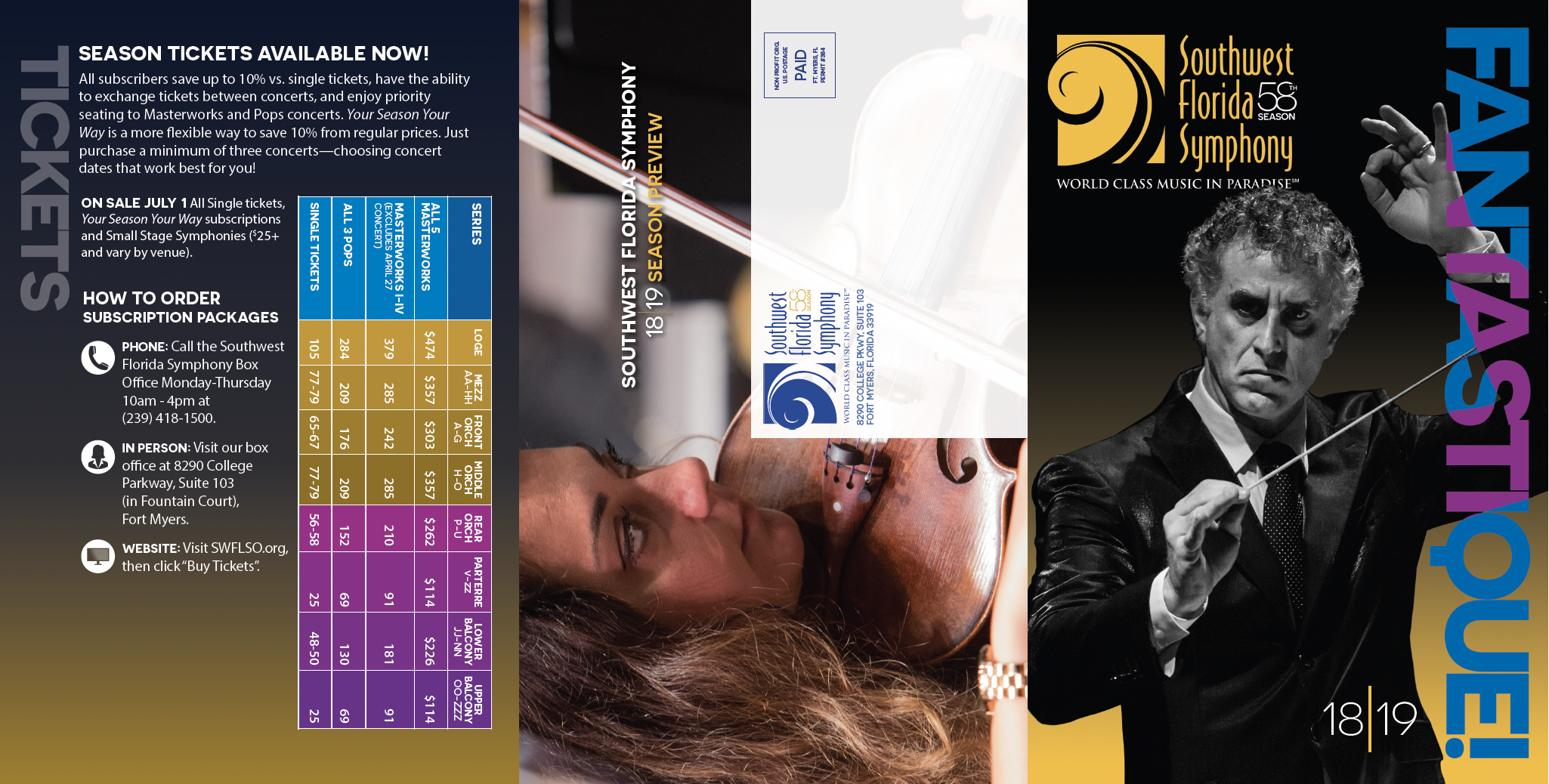
Side 1
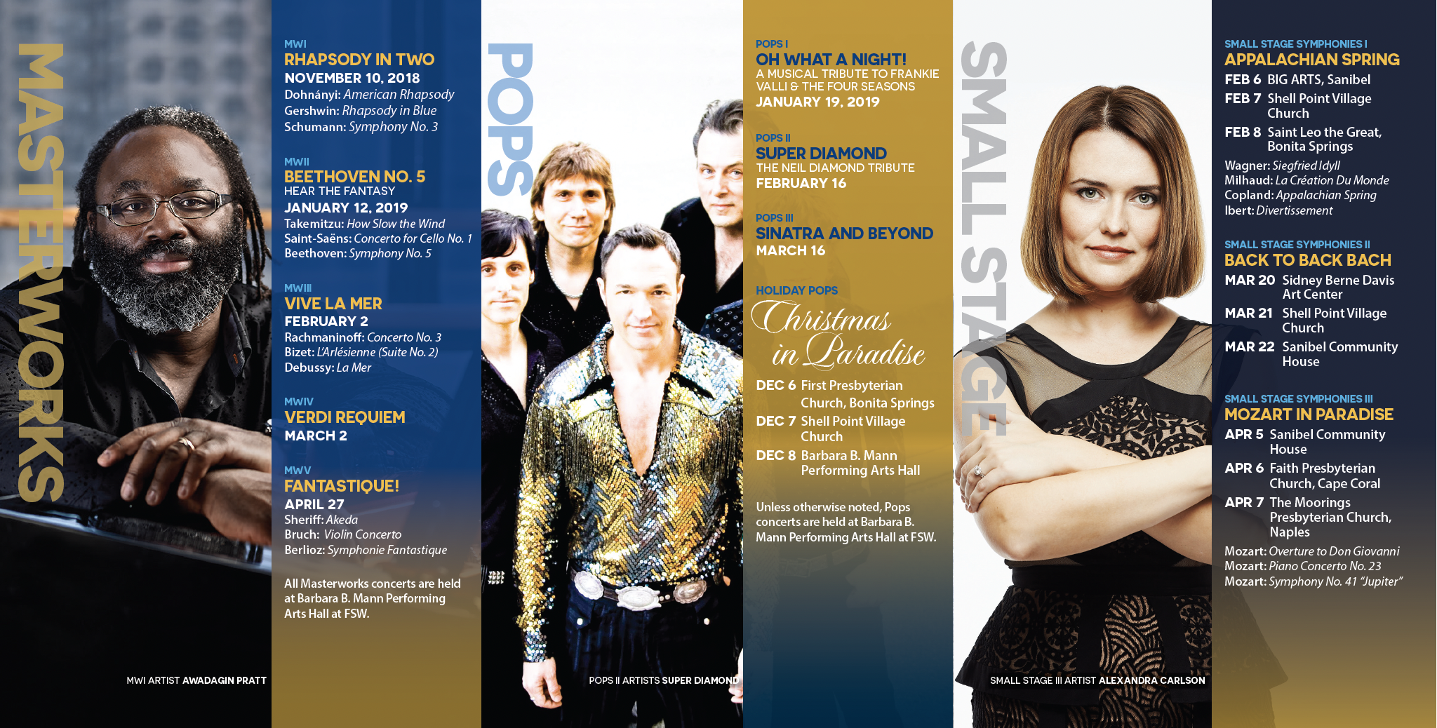
Side 2
Social Media
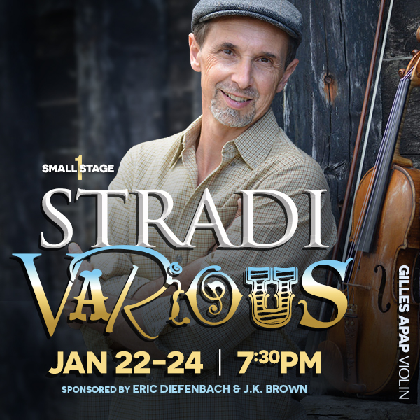
Stradivarious
This ad highlights the breadth of musical genres presented in this concert by this soloist—thus the varied fonts in the title. The concert title is, of course, taken from a classic violin type used by the soloist. I used the identical artwork (with the addition of the Southwest Florida Symphony Orchestra logo) in a 9-foot banner that hung outside the Sidney Berne Davis Art Center where the concert was performed.
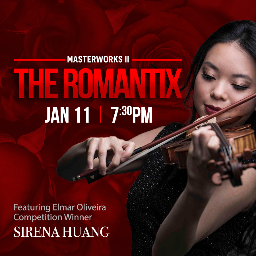
The Romantix
The Romantix features music from the Romantic period and a young, local solo violinist. I closely cropped an image supplied by the artist and used huge red roses for the background as a play on the word Romantix.
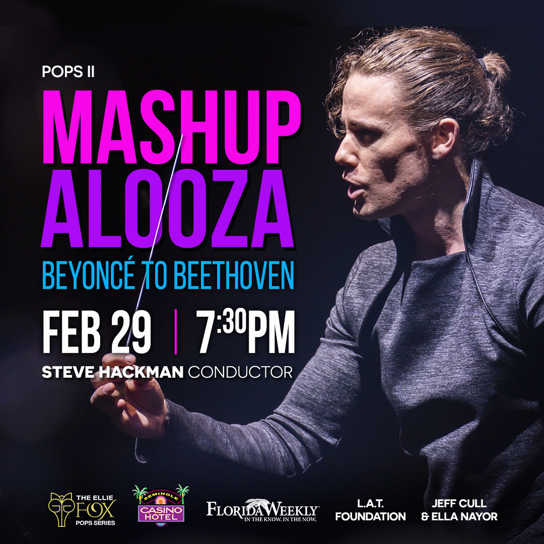
MashupaLooza
Mashupalooza is presented by conductor Steve Hackman who engineers a variety of mashups of classical and popular music as a way of reaching newbies. I chose a modern font and vivid colors for the same reason.
Print Ads
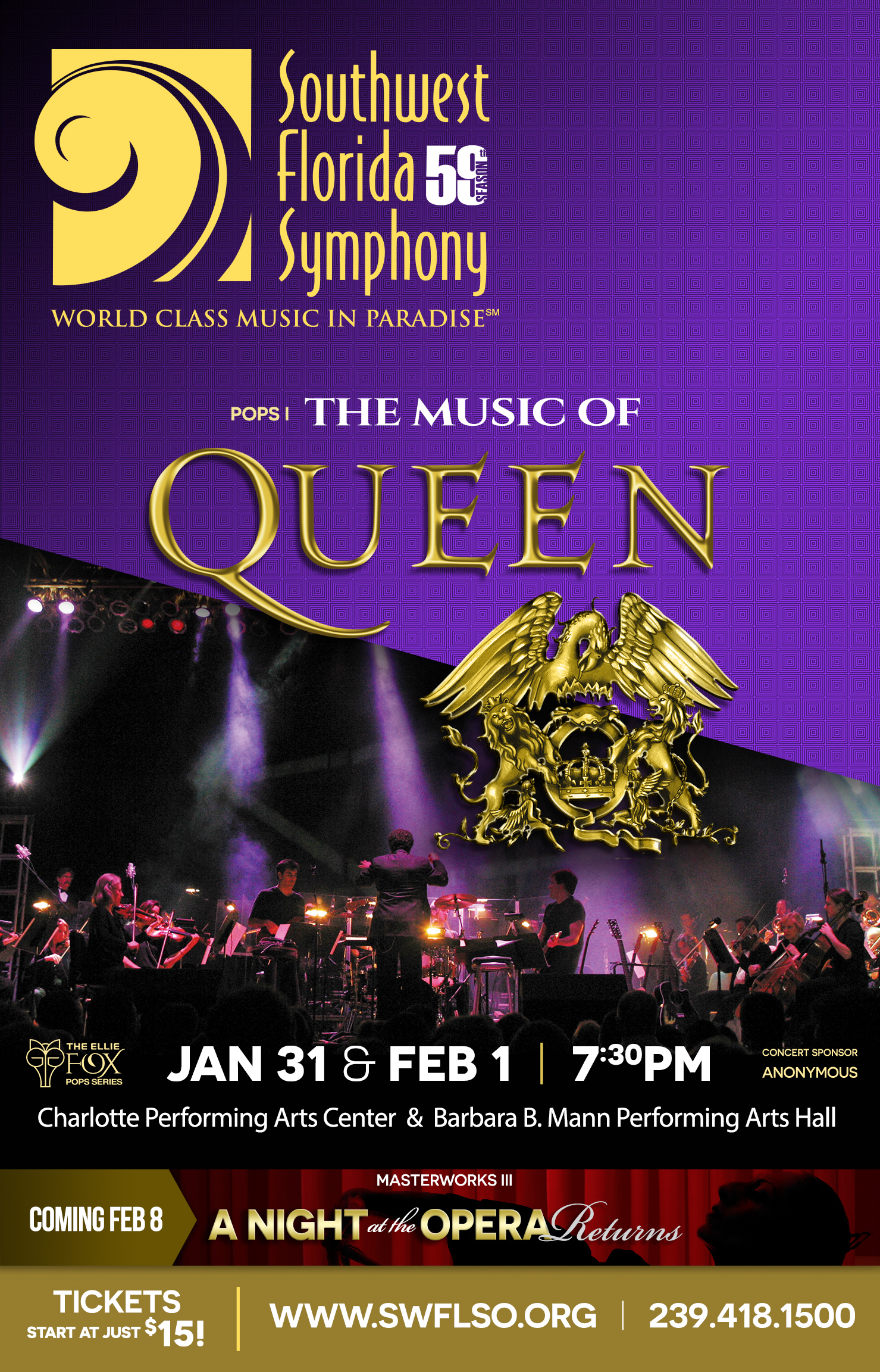
Queen
This ad and the rest ran in Florida Weekly the two weeks prior to the concert. Each concert should have its own look and feel but retain the identifiable branding of the symphony.
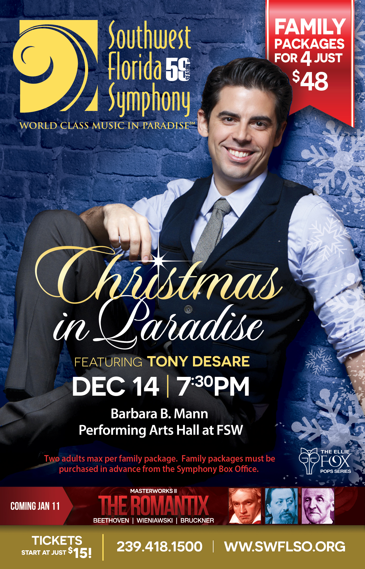
Holiday Pops
Branding is maintained throughout this campaign by logo placement, colors, fonts and other ad structure that is consistent. The audience comes to expect and look for this brand identity.
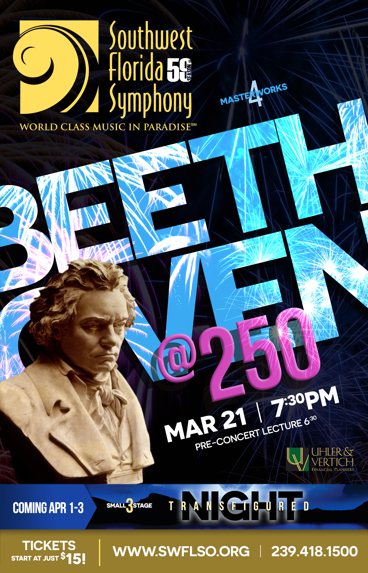
Beethoven @250
The “coming up” banner at the bottom of the advertising whets the appetites of potential concert goers, preparing them for what’s next.
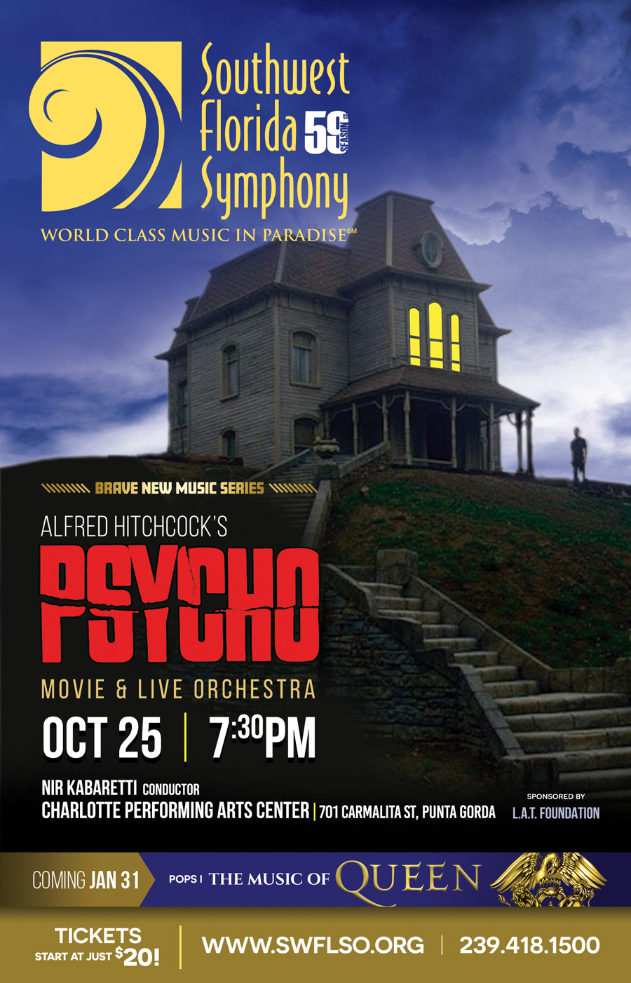
Psycho
This ad promoted the Psycho movie while the orchestra played the musical score live. I was able to use assets from the original movie because they are now within the public domain.