dotBatts Designs

ABOUT DOROTHY

Dorothy Batts graduated from the University of North Carolina at Chapel Hill with a BA in Journalism and a concentration in advertising. She started her professional career as an advertising copywriter at Young & Rubicam New York. After nine years and several industry awards and honorable mentions, she became media arts director for Word of Life Ministries in Long Island, New York and then Fort Myers, Florida. In 2013, Dorothy launched her own graphic design business. At dotBatts Designs, she combines your copywriting and design gifts to create branding for her clients—mainly non-profit organizations. Recently, she earned a Master of Fine Arts Degree in Media Design from Fullsail University. Dorothy would be honored to put her talent to work for you.

PROBLEM SOLVING

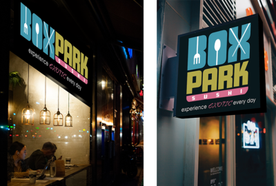
As a new pop-up mall located in the East End neighborhood of Milwaukee, BoxPark introduced a new sushi bar. BoxPark Sushi needed to create a strong presence in a market already full of sushi bars and Japanese bistros. The solution was to target the 45% of Midwesterners who have never tried sushi.

The target market are young professionals who want to love sushi and to belong among their sushi-loving friends and colleagues whom they admire; but they are squeamish about trying it. The strategy positions BoxPark Sushi—not as foreign food, but—as an everyday adventure supported by the tagline: Experience exotic every day.

The BoxPark brand will appeal to their esteem and self-actualization needs in Maslow’s hierarchy. It will also appeal to their need for diversion in Settle and Alreck’s shopping list of needs—the need to relax, have fun, escape from routines and be entertained (Felton, 2013, pp. 26-30). This strategy presents an opportunity to convert non-users, expand the general sushi market in Milwaukee and reap the benefits for BoxPark Sushi.
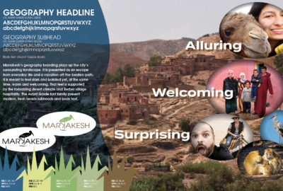
 

RESEARCH

In creating the mood boards and logos for Marrakesh, the purpose is to give the client multiple choices of where to go with their city branding. The colors, fonts and textures all work together to bring about a look and feel for the city. As media designers, our job is to build the brand and sustain it by coming up with a strategy to consistently communicate a message that is clear and relevant to a defined group of people over time. The mood boards alone represent many hours of research, discovering the souqs (lively markets), street acrobats, the warm hospitality of its citizens, the Atlas Mountain hiking trails, unique wildlife and all of the other qualities for which Marrakesh is or is soon to be known, thanks to our well-crafted branding. Each of the three mood boards communicate different aspects of the city’s richness which will then be disseminated in its advertising, starting with its logo.

Marrakesh Branding

Increasing Tourism

Geography

The Geography branding uses blues, greens and golds to mimic the colors of the outdoors. It emphasizes the peaceful, natural surroundings and outdoor adventures to be found in the Atlas Mountains, cactus fields and neighboring valleys. It beckons its audience to escape the busyness of life for the restful beauty of marvelous Marrakesh.
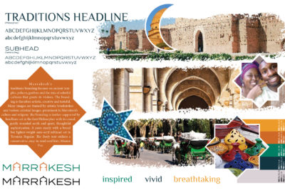
Tradition

Marrakesh’s Traditions branding draws attention to the luxurious palaces and rich, historic architecture which are prominent throughout the city. The Marrakesh culture is very friendly and hospitable. Therefore, the color palette is warm and welcoming.
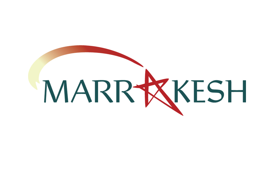
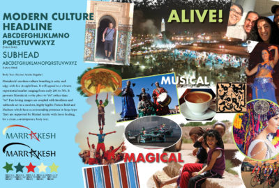
Modern Culture

Marrakesh is called the Red City because of its clay walls. The other colors in the palette capture the city’s youthful energy with its street artists, colorful souqs (open markets), lively nightlife and unique cuisine. The target is mostly young millennials looking for a high octane getaway.

INNOVATION

BoxPark Sushi is going after an entirely new audience of non-users, so it made sense to break out of the usual mold of sushi and Japanese graphics. The BoxPark branding departs from the usual red, orange and black palette of its competitors, using entirely different colors that are youthful, energetic and creative. The thick letter strokes and rounded curves of the BoxPark wordmark couldn’t be further from script fonts Japanese restaurants adhere to. It’s what designer and branding guru Marty Neumeier called zagging while everyone else zigs.

Competitor Logos

Boxpark Sushi Logo

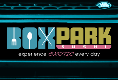
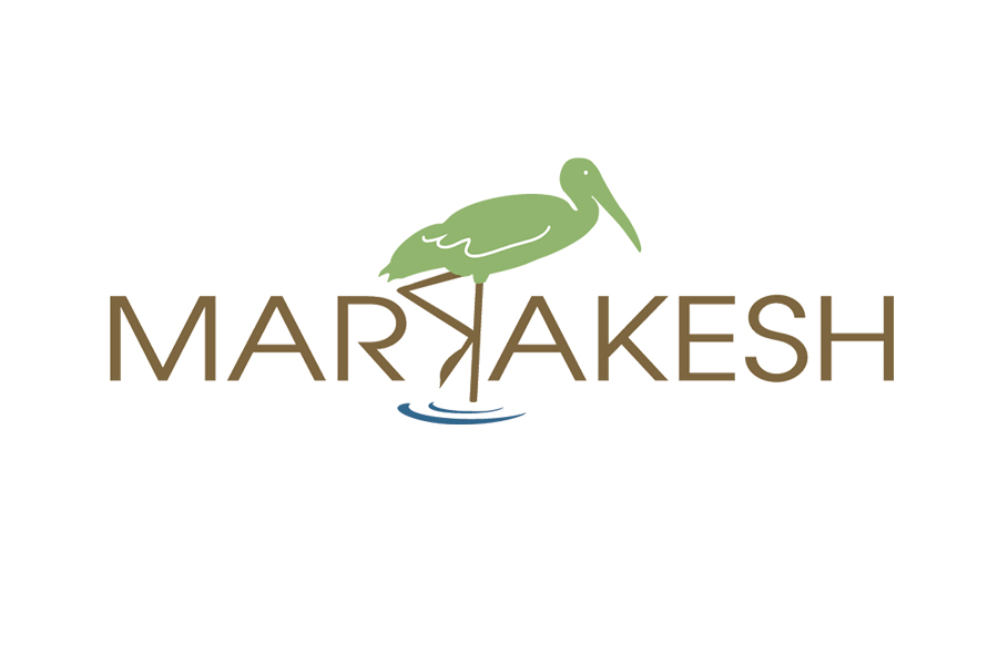
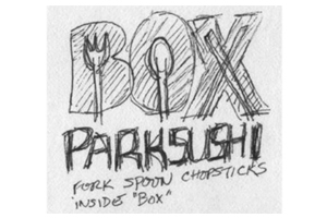
As a new brand in a crowded market, it was critical that BoxPark set itself apart from the pack. Early logo sketches sought to reach out to non-users by making sushi (i.e. chopsticks) seem less “foreign” (scary, distasteful) and, instead, re-cast it as an everyday adventure. 


Test

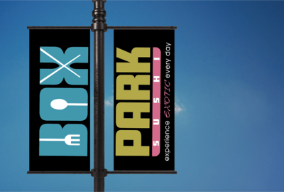
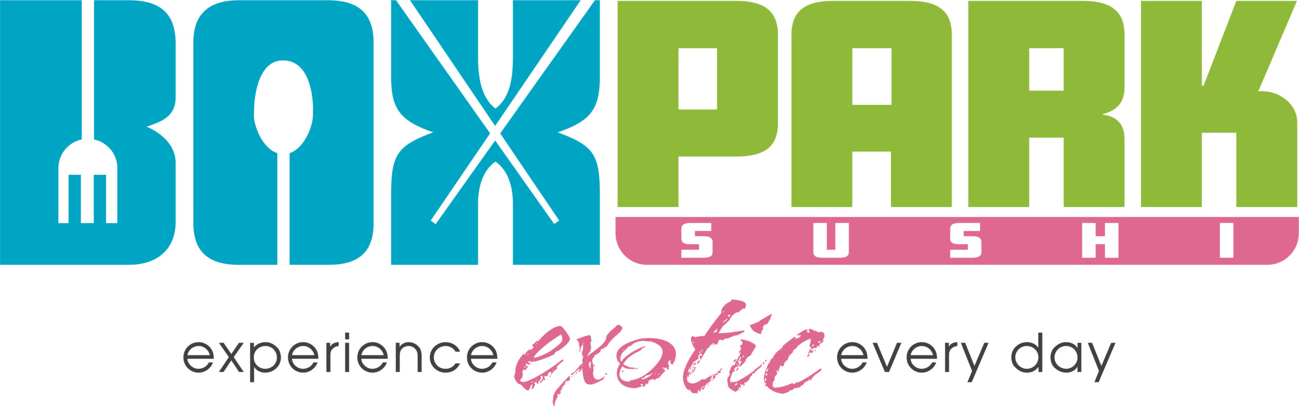
In pursuing a new target market, BoxPark further set itself apart by introducing a more youthful, creative color palette than its competitors. However, primary research indicated that the colors above did not communicate energetic, fun and friendly—BoxPark’s brand personality. So the colors were tweaked to achieve a better outcome.

Final 

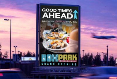
The brighter colors of the updated color palette say life, renewal and abundance. The utensils present a mash-up of West and East, the familiar and the exotic. The new branding will better reach a new market of sushi virgins that BoxPark can, over time, nurture  into aficionados—thereby building the market and the brand. 

What clients say

  • When it comes to graphic design and creating marketing materials that build visibility, credibility and drive revenue, Dorothy Batts is right on the money. For nonprofit organizations, like ours, Dorothy’s design work grabs the attention of donors and event fundraising sponsors. She is pleasant to work with, and the results of her design work takes our breath away.
    Michael ChatmanMichael ChatmanPresident & CEO, The Community Foundation
  • Dorothy Batts is an absolute pleasure to work with and feels very much like part of our team at the Southwest Florida Symphony. Her ability to clearly take direction, creative ability on a moment’s notice and strong attention to detail are just a few of the many wonderful qualities she possesses. From print collateral design to video production and beyond, I highly recommend Dorothy Batts for the creative needs of any business.
    Amy GinsburgAmy GinsburgExecutive Director, Southwest Florida Symphony
  • Dorothy is very innovative, always looking for new solutions and fresh ideas that can advance her knowledge to exceed her client’s expectations and goals.
    Paul LodatoPaul LodatoGeneral Manager, CTN Faith & Family Television
  • We have a high standard for our communications and Dorothy always comes through with well-crafted, timely, and innovative designs. She is responsive to our feedback even on tight deadlines.
    Stephen JenksStephen JenksDirector of Operations, Eagles’ Wings
  • Dorothy left her job at a prestigious Madison Avenue advertising agency to come on staff at Word Of Life Ministries. Dorothy humbly offered her expertise in media arts to this ministry with a spirit of excellence and professionalism. Her spiritual integrity and natural ability have played an integral role in establishing our identity as as successful and respected ministry in America and abroad.
    Pastor Gaspar AnastasiPastor Gaspar AnastasiWord of Life Church
  • How rare it is to find a person so incredibly full of talent and creativity… yet possessing uncommon integrity and a warm, caring demeanor! Dorothy is a person I look forward to dealing with. Her work never ceases to amaze me.
    Pastor Steve BrowerPastor Steve BrowerFaith & Victory Fellowship
  • Dorothy, you have done a brilliant job in designing our Jett & Company Interior Design website!! It makes an exceptional first impression and is easily navigable. Thank you for your creative input while meeting a tight deadline with a demeanor of calm and ease…though I know the tireless hours you fastidiously worked to make it happen…I so appreciate your commitment to excellence! You are a rare gem! Oh! One more highlight….the multitude of unsolicited compliments I receive on my business cards! Great job!! Another exceptional first impression!
    Jett SegalJett SegalCEO, Jett & Company Interior Design